Sunday 27 February 2011

Yellow


Last December's issue of The World of Interiors recreated the Yellow Room that Nancy Lancaster had decorated in her home in Mayfair in 1959. The editor Rupert Thomas worked with Colefax and Fowler to remake this room and was photographed by Christopher Simon Sykes.


When I was looking for a room that could express the liveliness of yellow, this image, the room and the whole project to recreate it kept attracting my attention. The color definitely stands out, but doesn't dazzle and I could only attribute that to the balance of the whole room. Yes it is a large room of generous proportions, strong color is best with high ceilings and good natural light, but the arrangement of the furniture and the use of "pairs" of objects makes the room exceptional.


The article points out that "initially the color was much paler, more like that of a lemon, but over years it darkened to the deep buttery yellow of legend." 

This is a very sumptuous room, formal but comfortable. Even though we don't decorate like this today, you can see the principals of design: light, color, balance, proportions, symmetry all considered and working together. I wish I could have seen this room and it is amazing it was all recreated for a photo shoot. However it has given us a reference of a room that has influenced many designers and decorators over the years.

Yellow is a very good color for London, it works well with the gray skies, it is the most light reflective of colors so it will always brighten and warm up any space more than many of the grays and taupes used so often today. 

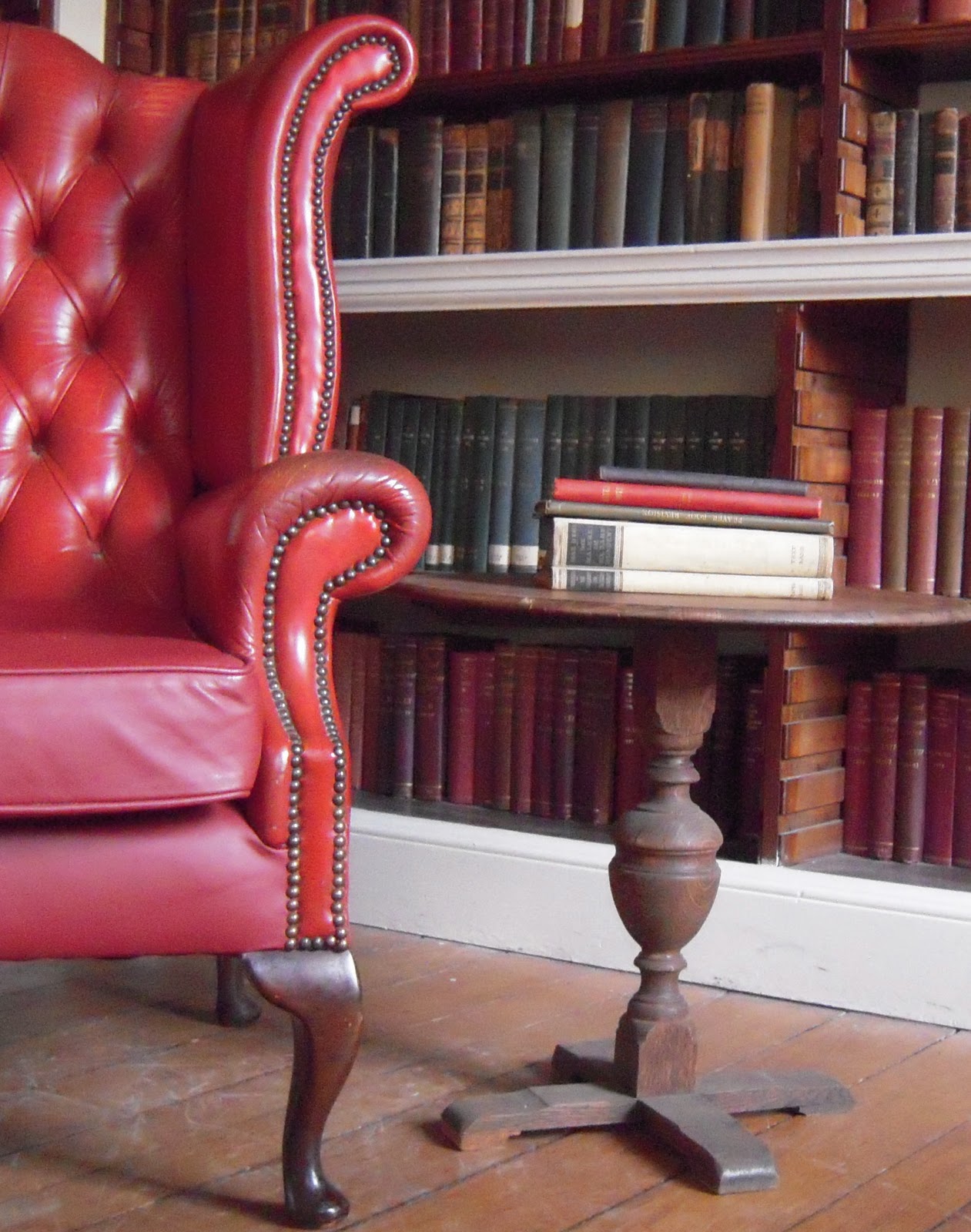
From formality and sumptuousness, I was also attracted this week to some faded, worn and weathered spaces. There is always something that stimulates my imagination seeing a room that needs a new coat of paint:

Source: flickr.com via Kelly on Pinterest


Source: flickr.com via Kelly on Pinterest


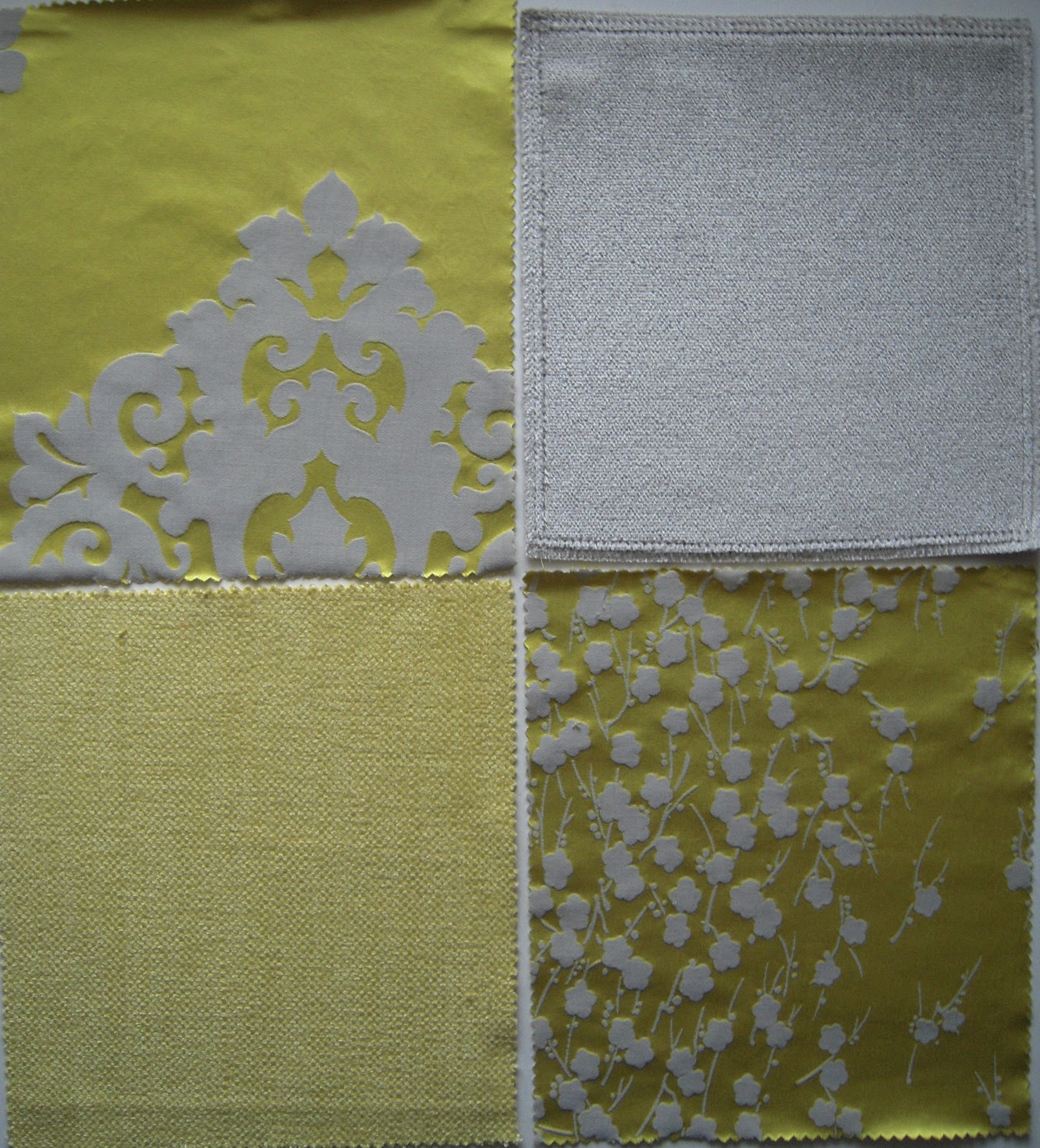
When I biked to Chelsea Harbour this week I saw some swatches that would work in many London rooms: Lemon yellow and grays: I could see a plush velvet sofa with bright yellow satin pillows and a shower of curtains.


An old chest of drawers and mirror I had painted:


Today the sun is shining and the sky is actually blue, must get on my bike... the daffodils are everywhere.

Monday 21 February 2011

Orange


I was with friends this week and when Minsun mentioned her favorite color is orange I said that is my color this week. Orange made up of red and yellow has a zingy feel, like the sweet bite you get from the fruit and like that sweet flavor, orange rooms have a zest, they are warm and as an accent it adds a punch.

In a recent project a lovely living room and tv room of taupes, linens and white velvets we tried so many colors, pink, red, green, a deep brown, to accent and bring the two rooms together.  Orange was it, lively, warm and satisfying.


other examples of orange used for accents in a neutral scheme ... great rug.


I love the mid century style and orange was used much with a very white bright paint, it was refreshing and modern, like the tulip chair:


I still find this chair so modern and graceful.

 The color becomes earthier when it is darkened like burnt oranges and clay pots. Terracotta is a color I have learned resonates with many people


 and it is like this on walls, makes a room very inviting and gives it depth.

Source: dulux.co.uk via Kelly on Pinterest

Source: dulux.co.uk via Kelly on Pinterest


When I saw this orange and the gorgeous bed, I thought Minsun would like this for her new flat:


Great bed......


Monday 14 February 2011

Red


Red the color of Valentines, hearts, for lovers and one of those colors that always turns heads. You take a second look and when it is a sofa you want to stretch out with those you love.

or from the ground up


And warms up a room on the walls

or adds sculpture:


Amazing how different patterns can work using one color.

Red makes a strong, attractive accent:


even a small accent:


And as lighting:


Red lighting is warm and always flattering, lovely to have over a dining room table.


Happy Valentines Day...........


Monday 7 February 2011

Colors


I will always remember my favorite Christmas present was a box of 100 crayons, all those colors laid out in a flat box. I remember the names of the colors: carnation pink, blue green, purple, magenta, salmon pink, raw sienna, scarlet, orange, lemon yellow and there was silver and gold, etc, yes a box of crayola crayons.

That time spent coloring and making clothes led me to design. Today I still get a thrill from color in its raw state as pigment; mixed as paint or dye then seeing the results on a wall saturated with a color, a piece of fabric soaked in dye, to nature, trees, flowers, sky, water...


The artist was the person in culture who was the master of blending, mixing and matching colors. But in recent times artists, who receive the attention, have been more interested in shocking us or disgusting us rather than exploring the magic, seduction and beauty of color.

However the designer and photographer in all their practices have been using color in stunning ways: in graphics and illustration, fashion, textiles and interiors, all the areas that have made our lives richer and more enjoyable.


I want to share with this blog my love of color and light, its close companion and design. How these elements enrich, inspire, stimulate, move, stir, energize, incite, animate, fire, excite, spark, affect and influence our hopes, dreams and lives.