Showing posts with label yellow. Show all posts

Sunday, 21 July 2013

Yellow


There has been sunshine all week in London, we are all so cautiously pleased, suspecting the sky to cloud up anyday.... however, enjoying the light and warmth. Bring some yellow into your home, paint a door or window, put a yellow picture on the wall.

Plates and chair from Anthropologie

Tuesday, 5 February 2013

nyc style


 NEW YORK CITY STYLE #3


 The Human Honey Bee

                                               
                                                         Wolfgang Laib

                           POLLEN FROM HAZELNUT                        
This exhibition is in settled residence in the Marron Atrium at the Museum of Modern Art in New York.  The artist considers this area to be the "womb of the museum"and created this brillant and bedazzling work especially for the site, It is the largest pollen installation to date.


"Pollen is the essence of the flower" 
"Potential beginning"
                                                                    "The male seed"

                  The luminous and commanding vistas from all vantage points!!!!!                                    


                            The artist said, "it takes hours and hours, days and days" to collect
                                                        the beaming and radiant pollen!!


                             Make all effort to see and feel this wondrous exhibition. The color yellow is
                             is represented in the etheric human body at the solar plexus chakra, the power
                             center. Extraordinaire!
                                                     

Friday, 30 March 2012

Spare Beauty: The Cuban Kitchen

"The Picture Show" is a page on the NPR website of photo essays, photos from around the world people submit with a comment to explain their story. I look at it fairly frequently, it is intriguing and always fascinating. Yesterday I saw a collection of photos about kitchens in Cuba by Ellen Silverman.

There were many reasons I was so attracted to these photos having designed many kitchens, some posh and great, some humble and old, just getting a new coat of paint. Another reason is I am in the middle of renovating my kitchen, my apartment is in an old building and with the change of the boiler, cabinets removed and striping off old wallpaper, my own kitchen looks similar to these humble and human kitchens in Cuba.

But more than the similarity to my renovation is the beauty and simplicity. I often find beauty is from within, for a kitchen is where we cook and prepare food, it is more than yards of exotic granite and powerful appliances it is where we sit and nourish ourselves and feed our loved ones.


Ellen is a food photographer and in her travels to Cuba over the past couple of years she was captivated by the elegant but decrepit old buildings. After being invited in, from her statement she explains:

"I began to see the beauty of these sparse kitchens created from necessity by the people who live in these exceedingly difficult circumstances. It forced me to confront the profound difference between what my eye saw, my desire to make beautiful, strong images, and the reality people’s situations."

The composition of Ellen's photos are beautiful, she captures in her frame a balance of light, the "natural and organic arrangement" of vessels and utensils and the color of faded paint. Her images are strong but so touched by humanity.

I grew up in Miami where there are many Cuban emigrants and one of the delights is their food, I can so easily imagine the rice and black beans cooking, the cafe con leche and tostadas. And also when my daughter lived in Tulum Mexico, when I visited her we made guacamole in a sparse kitchen.


This photo reminds me of the movie, A Street Car Named Desire.


What more do we need, nourishment and a song. Please view this poignant collection of photos from Ellen Silverman's website


Friday, 27 January 2012

Herringbone


Herringbone.

On my work table, samples of fabrics, wallpaper, paint and other materials collect as I put together schemes for rooms. I sort them frequently in colors and patterns, it is like a palette.

Herringbone is a pattern I have always loved, I like the simple geometry of it, the change in threading the heddles on a loom, from 1,2,3,4, to 4,3,2,1, so simple but effective.

It is a fabric and pattern usually used for mens suits, a tweed jacket, but I like to see it on a wing back chair, a slipper chair or cover a sofa in it. Simple, dynamic, tailored.


Sunday, 13 November 2011

Wednesday, 26 October 2011

Ikats


Mu Raspberry

Stripes Sunburst

Mu Saffron

Stripes Celery

Mu Blue

Stripes Iris

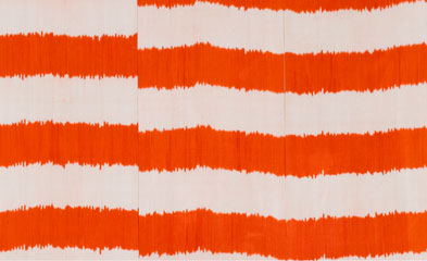
Ikat is a way of creating pattern with dyes in textiles before the fabric is woven. It is an ancient technique that was discovered and practiced around the world.  It is done when you are making the warp and the weft by binding sections of the yarns with rafia to block out or resist the dye when it is soaked in the dye bath.

It is different from tie and dye we see on t-shirts because that is done after the textile is woven and the garment sewn.

Both techniques of tie and dye create beautiful patterns and can make wonderful play of color.

Madeline Weinrib atelier has created from this ancient technique of pattern making a collection of fabrics, rugs and pillow covers with astonishing vibrant colors and patterns. They are simple, graphic and bold, modern and colorful. They would be a welcome splash of color to many modern interiors of whites and taupes. But imagine how beautiful they would be as curtains or blinds against a fashionable charcoal wall.

Take a moment to enjoy the colors and patterns on her website http://www.madelineweinrib.com. The fabrics and rugs are available at ABC Carpet and Home and in Harrods in London.


Saturday, 27 August 2011

Purple


Purple, the complement to yellow, made up of red and blue.

We have a long weekend in London, have a good and relaxing time. I am celebrating my son tomorrow, his birthday. Happy Birthday William. xxx


Monday, 22 August 2011

Sunday, 15 May 2011

The Unmade Bed

World of Interiors, June cover photo, Ricardo Labougie


When we were growing up, we were taught always to make your bed in the morning. My Mom would say if you were not able to get anything else done in the day, make your bed, it will always feel tidy and organized.


I have been aware over the last few years, the unmade bed is shown in magazines, across blogs and in advertising catalogues. Photographers and stylists have left beds unmade, messy and pillows rumpled. Each photo shows a bed evocative of a long Sunday morning with coffee and the New York Times or the tender moments of reading stories to your little ones and most pleasurable, shared intimacy with your lover.

In photos for portfolios, magazines and advertising, the bed used to be smooth as a board, with a neat stack of elegant pillows. I was thinking of where the ideas of messing up the bed came from and remembered Tracey Emin exhibited her bed at the Tate Gallery for the nomination of the Turner Prize in 1999.


Tracy's bed tells a different story, one of profound sadness with the mess around the bed of refuse of personal matters, it speaks of the inability to care for oneself or others after relationships fall apart.

I always thought Tracey should have written the story and let our imagination fill in the sordidness, but now the materiality of it is an interesting contrast to the sumptuous and dreamy beds that are used to awaken our feelings of intimacy.


  A beautiful bed painting by Maggie Sinner

I still make my bed everyday, I like to pull the covers back and get in between clean sheets each night.

Sunday, 27 February 2011

Yellow


Last December's issue of The World of Interiors recreated the Yellow Room that Nancy Lancaster had decorated in her home in Mayfair in 1959. The editor Rupert Thomas worked with Colefax and Fowler to remake this room and was photographed by Christopher Simon Sykes.


When I was looking for a room that could express the liveliness of yellow, this image, the room and the whole project to recreate it kept attracting my attention. The color definitely stands out, but doesn't dazzle and I could only attribute that to the balance of the whole room. Yes it is a large room of generous proportions, strong color is best with high ceilings and good natural light, but the arrangement of the furniture and the use of "pairs" of objects makes the room exceptional.


The article points out that "initially the color was much paler, more like that of a lemon, but over years it darkened to the deep buttery yellow of legend." 

This is a very sumptuous room, formal but comfortable. Even though we don't decorate like this today, you can see the principals of design: light, color, balance, proportions, symmetry all considered and working together. I wish I could have seen this room and it is amazing it was all recreated for a photo shoot. However it has given us a reference of a room that has influenced many designers and decorators over the years.

Yellow is a very good color for London, it works well with the gray skies, it is the most light reflective of colors so it will always brighten and warm up any space more than many of the grays and taupes used so often today. 

From formality and sumptuousness, I was also attracted this week to some faded, worn and weathered spaces. There is always something that stimulates my imagination seeing a room that needs a new coat of paint:

Source: flickr.com via Kelly on Pinterest


Source: flickr.com via Kelly on Pinterest


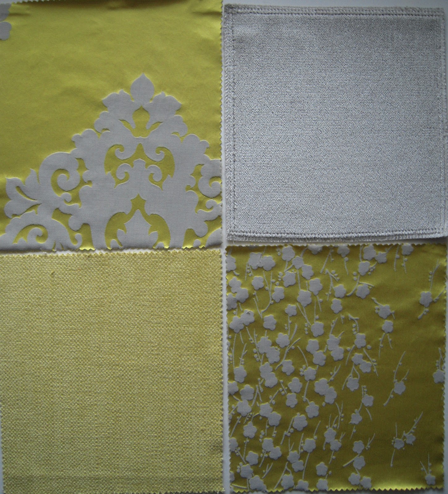
When I biked to Chelsea Harbour this week I saw some swatches that would work in many London rooms: Lemon yellow and grays: I could see a plush velvet sofa with bright yellow satin pillows and a shower of curtains.


An old chest of drawers and mirror I had painted:


Today the sun is shining and the sky is actually blue, must get on my bike... the daffodils are everywhere.

Monday, 7 February 2011

Colors


I will always remember my favorite Christmas present was a box of 100 crayons, all those colors laid out in a flat box. I remember the names of the colors: carnation pink, blue green, purple, magenta, salmon pink, raw sienna, scarlet, orange, lemon yellow and there was silver and gold, etc, yes a box of crayola crayons.

That time spent coloring and making clothes led me to design. Today I still get a thrill from color in its raw state as pigment; mixed as paint or dye then seeing the results on a wall saturated with a color, a piece of fabric soaked in dye, to nature, trees, flowers, sky, water...


The artist was the person in culture who was the master of blending, mixing and matching colors. But in recent times artists, who receive the attention, have been more interested in shocking us or disgusting us rather than exploring the magic, seduction and beauty of color.

However the designer and photographer in all their practices have been using color in stunning ways: in graphics and illustration, fashion, textiles and interiors, all the areas that have made our lives richer and more enjoyable.


I want to share with this blog my love of color and light, its close companion and design. How these elements enrich, inspire, stimulate, move, stir, energize, incite, animate, fire, excite, spark, affect and influence our hopes, dreams and lives.